Although the release of Mi 13 series, originally scheduled for yesterday, has been delayed, there have been a lot of recent revelations, especially after the Courier leak.

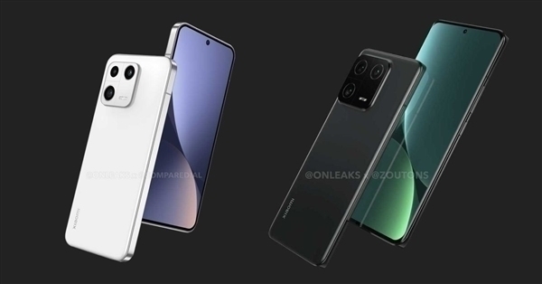
The official design of the new phone has been revealed earlier, with the Mi 13 having straight edges and a straight screen, while the Mi 13 Pro is still hyperboloid.

Due to the straight screen + straight edge design, many netizens were worried about the appearance and feel of the Mi 13 standard Edition, but now some bloggers who have tried the real phone bring good news.
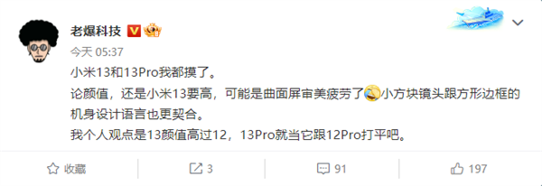
Well-known accessory maker/digital blogger Laowang Technology said today that after touching the Mi 13 and Mi 13 Pro, it found that the Mi 13 has a higher level of appearance with straight edge and straight screen.
In addition, with the new square rear camera module, the overall design language is relatively agreed, and the appearance level is even higher than the MI 12.

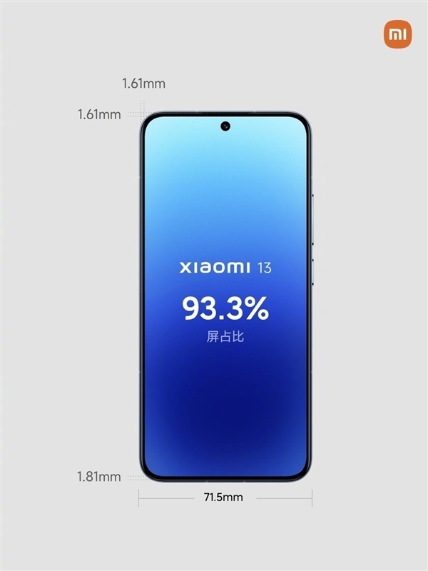
In addition, as it can be imagined from the previous official warm-up, this time the Mi 13 front screen specifications are also very good, especially the ultra-narrow frame, 1.61mm top, left and right sides almost broke the record.
The only slightly wider chin is 1.81mm wide, which is much narrower than the 2.15mm on the iPhone 14 Pro.
And because it is only 0.2mm wider than the other three sides, the visual effect is almost equal to the width of the four sides, the whole is still very impressive.
Read Also: DJI Mini 3 Drone Passed the FCC Certification: Priced at £827.97
As for the performance, Mi 13 standard edition has not been reduced, it is still standard with the second-generation Snapdragon 8+ Leica image, and even standard with IP68, except the iPhone industry almost no standard edition with IP68 manufacturers.


