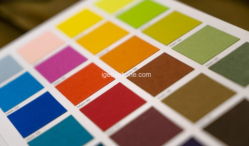
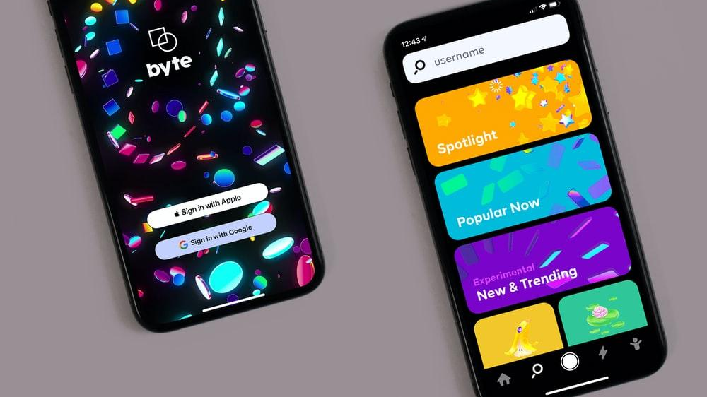
Who doesn’t love a well-designed interface with vibrant and appealing colors? According to marketing research, over 85% of consumers purchase items because of color. Thus, color plays a significant role in swaying customers in a certain direction.
User interface design is not an exception when choosing bright color palettes. UI designers can transform a design into an appealing product by adding a touch of color. Thus, color combination is a must-have skill for designers who create visual artworks.
Today’s digital revolution requires UI experts to be well-versed with color theory. Many companies do not shy away from experimenting with bright colors and striking gradients to attract potential customers. However, not all designers have the expertise to choose the right colors. That is why you need the services of a professional UI/UX design studio specializing in producing top-tier user interfaces.
Despite the benefits of incorporating bright colors in a web product, grey areas still need to be addressed. This article explores the benefits and pitfalls of a vibrant, bright UI.

Benefits of Bright Colors
Using a bright color palette can enhance your user interface design in the following ways:
Improves Readability
Experienced designers understand the significance of color choice and how it impacts users. Your customers must be able to read content easily without straining. Thus, UI designers always consider readability and legibility during color application.
Bright colors bring out a sharp contrast that enhances readability. You can easily differentiate the design elements from the text. However, it would be best to balance the contrast for excellent results. Too much contrast may weaken your design and hinder legibility.
Sharpens Navigation
You can easily notice bright colors on a website compared to neutral tones. That is why designers often use vibrant colors to create visual hierarchy. Since color influences the brain, you can add vibrant hues to offer clear navigation paths to the users. Such hues sharpen navigation, and customers can easily find what they want in your product.
One way of guiding customers is to use, for instance, the color red on the CTA buttons for intuitive purposes. Or you can use one color for related design elements.
Remember, bold colors are more noticeable, so use the right combinations to draw the users intuitively.
Elevates Brand Recognition
The human brain is wired to respond to bright colors, which is why bold tones are easy to notice and memorize. Colorful interfaces are more likely to stand out from other products with toned-down colors. However, you must choose colors that resonate with your brand goals and market research.
Today, companies pick vibrant colors and use them on all their items, from the logo to the products. This approach enhances brand recognition because customers will easily relate the colors to the brand. Besides, the company’s products will have a visual consistency that gives them a competitive edge.
Creates Trendy Designs
Modern UI designers don’t want to be left behind when keeping up with design trends. Currently, vibrant tones and gradients are trending in the design industry. Many brands are using bright and exciting hues to make a statement. The conventional colors no longer limit designers in trying out new designs.
Thus, bright colors signify a modern outlook full of freshness and vibrancy. Customers today are more attracted to catchy interfaces and popping colors. Thus, we can’t deny the influence of color in lead generation.
Sets Customers in a Positive Mood
The psychology of color states that colors can greatly impact a person’s mood. You can use color to influence the behavior of users subconsciously. The human mind perceives colors and releases hormones that shift emotions. Thus, designers can exploit this by learning color psychology.
Moreover, you can use bright colors to convey a message or create the right atmosphere for your users. For instance, a gardening website should have calming nature colors like blue or green shades. Conversely, red and yellow tones can work well in a fashion and apparel online store.
Pitfalls of Bright Colors in UI
Here are some of the downsides of using bright color combinations.
Difficult to Match
When picking the right colors for your interface, you might find the bright colors tough to crack. You can’t pick any bright color simply because it looks good. Relying on your preference and intuition is a blunder that might compromise your entire project. Thus, ensure you are well-versed with the color theory and what colors work perfectly together.
Matching bright colors is a skill that not many UI designers possess. You must create harmonious compositions while thinking about the user. Make sure the colors you pick resonate well with your audience. Remember, matching appalling colors will turn off your customers within the first few seconds.

Loses Accents
You can easily lose color accents when using bold colors. If you are not experienced balancing the shades, your interface might become a visual mess. Besides, you might end up disguising the essential design elements.
Therefore, it is vital to understand the color application proportions. The dominant color should carry 60%, the secondary color—30%, and accent color—the remaining 10% of the UI space. These proportions provide harmonious and pleasing combinations for the human eye.
Unappealing to Mobile Interfaces
Even though bold colors enhance readability, they might bring out too much contrast on the interfaces. This can affect mobile users with small screens. Users might feel uncomfortable with bright font colors, which might affect readability. That is why designers should maintain a certain contrast level in mobile interfaces.
Unsuitable for Specific User Groups
Vibrant colors are exciting and make interfaces more appealing. However, not all user groups are comfortable with bold colors. For instance, yellow might seem off for an older age group but appeal to a younger audience. On the other hand, men love achromatic colors like gray or black, while women are more adventurous with color. Thus, it would help if you researched color preferences based on gender, age, or culture for optimal results.
Conclusion
Ultimately, color is a vital tool if used well by skilled designers. Despite the pitfalls, bright colors can boost your product sales through appealing interface design. Thus, learn to pick the perfect color palette that aligns with your business and product goals. Not forgetting to keep the user in mind when designing the interface.


