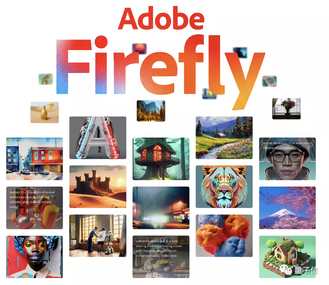
Over the last couple of days, a lot of people have started to get certified for Adobe Firefly.
It was only released in late March, but as a new AI tool from one of the leading companies in the design world, it was already expected to generate great results.
Jim Fan, an AI research scientist at Nvidia, was the first to offer this observation:
Can Adobe compete with MidJourney, a self-funded 11-person team?
Adobe Firefly vs. MidJourney
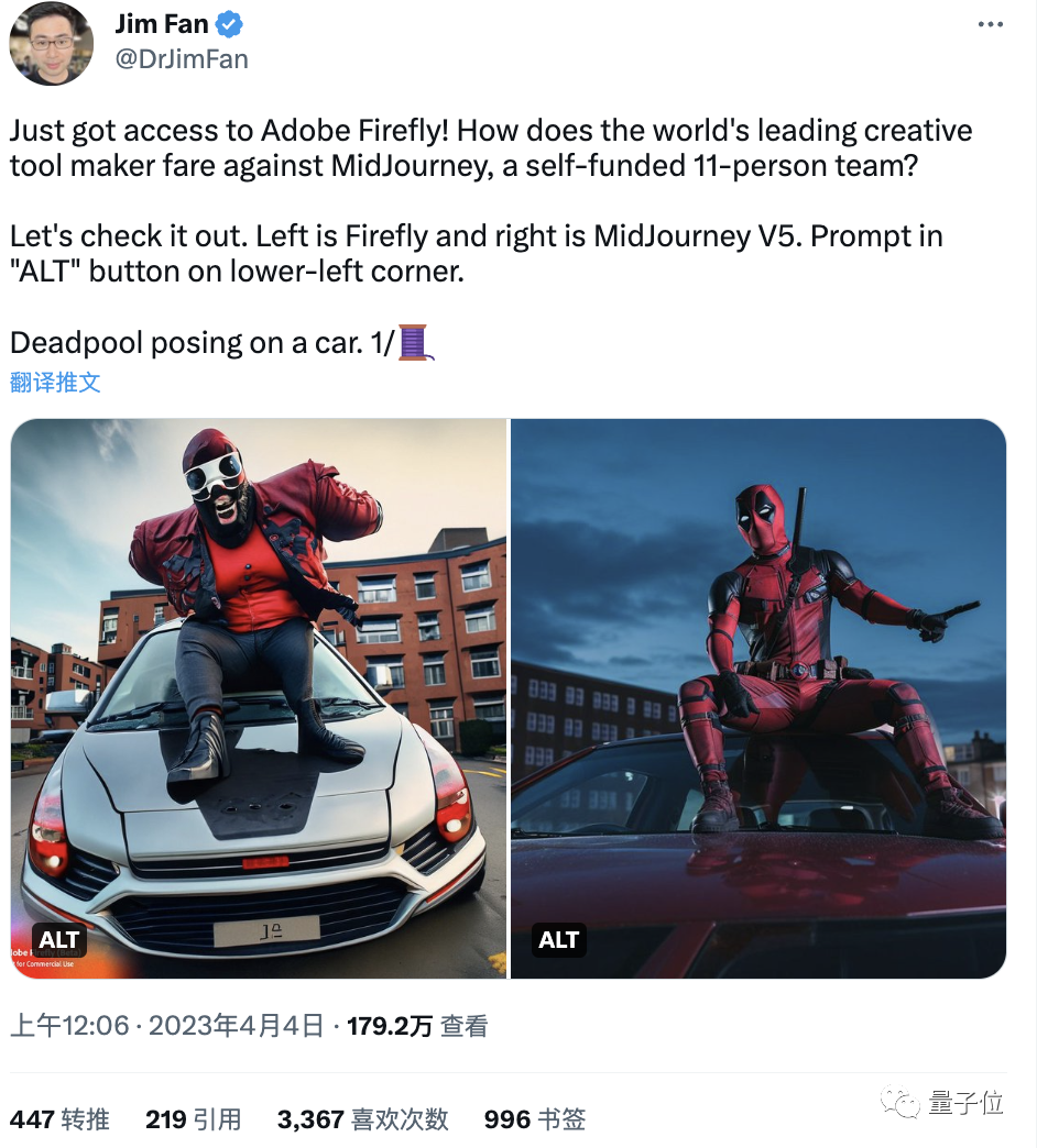
Jim Fan tested it for eight rounds.
The first round:
Look at the result: Firefly on the left, MidJourney on the right:
Are you sure that’s Spider-Man on the left and not the real Piggy Man?

Round 2:
result
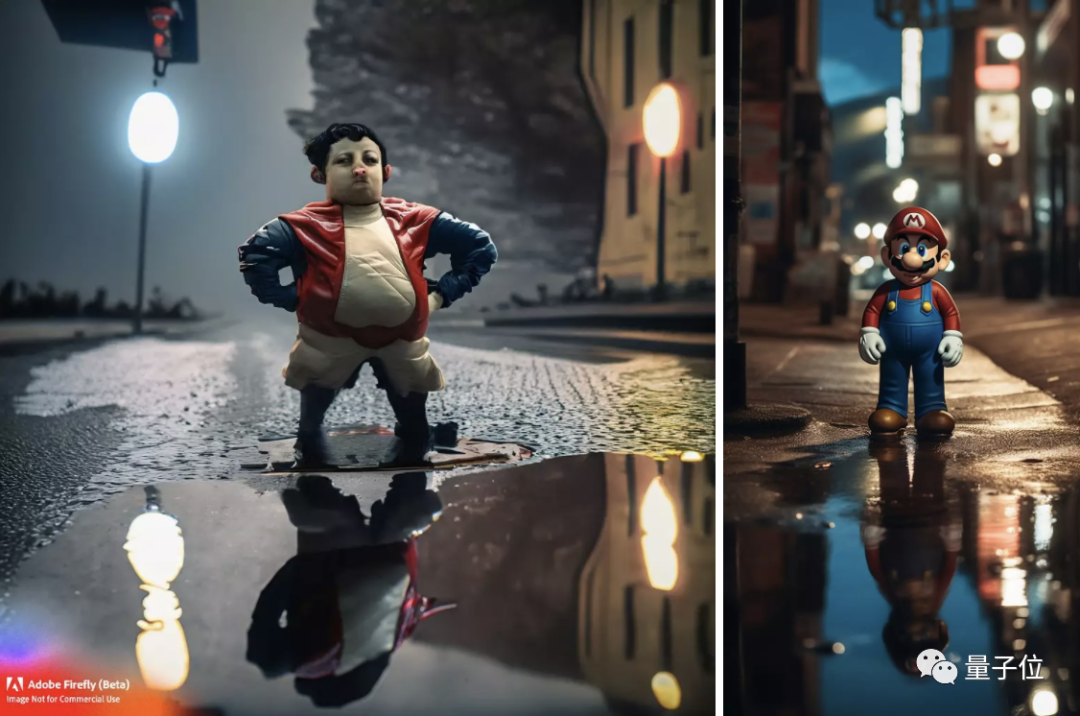
Super Mario aside, it feels like Firefly doesn’t do as well with setting and atmosphere.
The third round:
It’s the same cue word as Round two, but replace Super Mario with Pikachu.
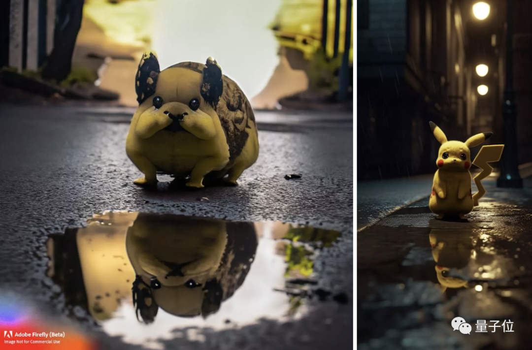
Pikachu aside, MidJourney captures the mood better. Firefly doesn’t even have a dark street this time around.
The fourth round:
Not the whole IP image, this round to see who is better at character photography.
Two totally different ways of presenting things, but Firefly is really, really distorted.
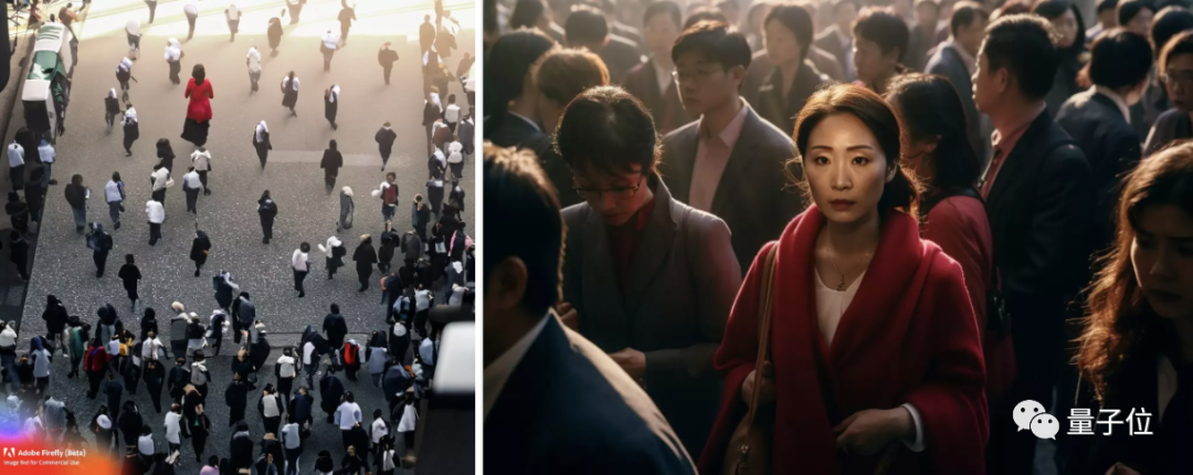
Round 5:
Let’s do a little more science fiction this time.
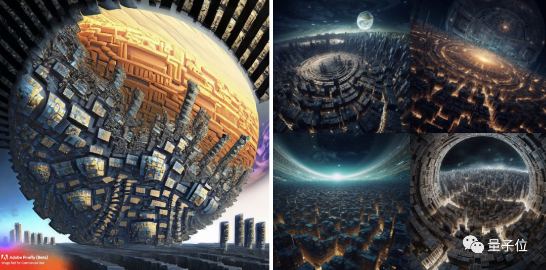
It feels like Firefly’s understanding of the word “round” is too superficial, and apparently doesn’t understand what “as seen from a spaceship” means.
The sixth round:

Now generate some mobile app icon design. Does Firefly know what that is?
Obviously it doesn’t know yet.
Round 7:
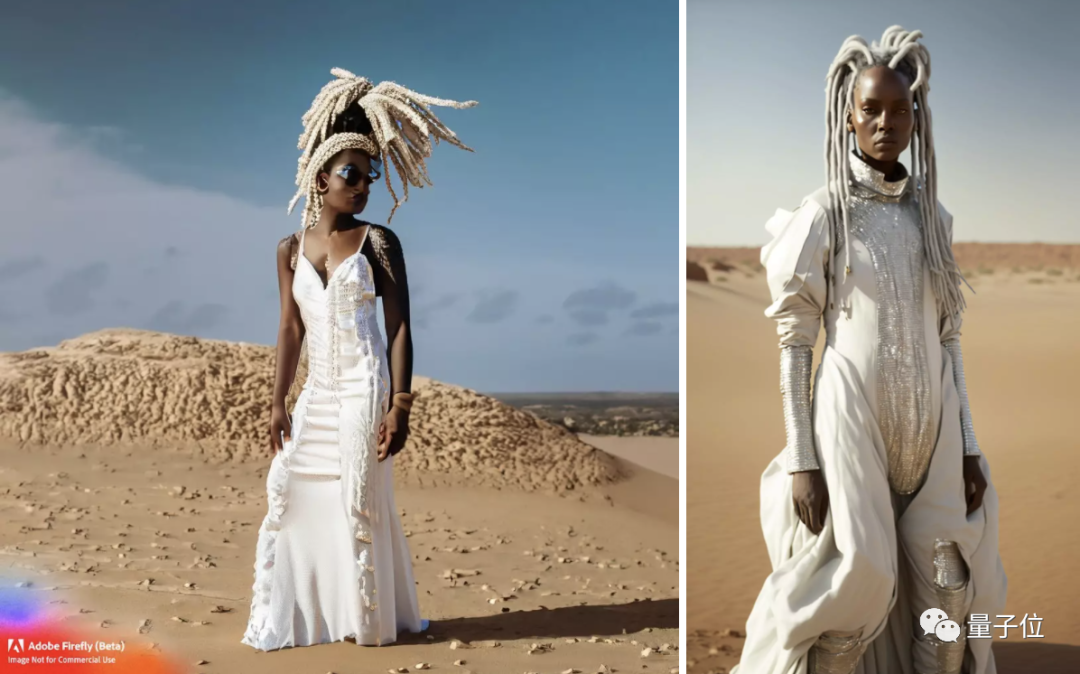
Press/TV/news style photo, mid panorama, afga vista still, a young Jamaican woman with white braids standing in the desert, wearing a vintage sequined Gucci white dress.
This round will focus on hand generation, which the AI is least good at.
At first glance, both are fine, but a quick look reveals that Firefly has a cross-dressing figure with disfigured hands and a background that is a fraction of MidJourney’s. However, the presentation of the two “white braids” is not to say the elder brother.
The final round:

That’s all right at first glance, but a closer look at Firefly’s background is fake, but Firefly says that painting dandelions is all about dandelions, and MidJourney adds a few other varieties, which slightly misses the point.
That’s it. Overall, Firefly is a dead rout. It’s like a schoolboy VS a college kid.
But as Jim Fan points out, this is understandable. After all:
(1) These hints have been heavily optimized for MidJourney and aren’t a fair comparison to Firefly, which is just coming out.
However, Jim Fan tried a few “variations” and still couldn’t get better results, which may have something to do with the fact that his prompts weren’t very good, mostly from netizens.
(2) Most importantly, Firefly claims that it has only been trained on Adobe Stock and fully licensed images.
This is a great disadvantage, but it is an important advantage for users who must secure the copyright of the exported images. Because these people are probably more willing to sacrifice quality for legitimacy.
Jim Fan further comments on this topic:
There are some pretty good ones
In fact, a quick search on the Internet will turn up some pretty good work from Firefly that doesn’t have that comparison.
You know, sort of save the day.
Like this one:
Firefly doesn’t do well with realism, but the cartoonish/hand-drawn effects can still work.
Midjourney Update: You can now create text with pictures
The mighty Midjourney continues to iterate.
A new command, /describe, allows you to describe an image in four words.
Netizens said: We can use the description it gives us to study how to write better prompt words.
However, regenerating the image directly from the description it gives can look a little different than the original, such as this “old man on the subway looking at his phone” meme tried by design aesthetics blogger @simon_Avin:
But one netizen was quick to offer a solution:
In addition to changing the prompt word manually, feeding the original image to Midjourney during secondary generation makes little difference.


