OPPO has officially begun recruiting private beta testing for ColoOS 13, which is based on Andiroid 13. This means that the new operating system will soon be available to customers.
Today, @digitchat posted some of the UI for the latest version of ColorOS 13 and introduced some of the changes made in the new version.

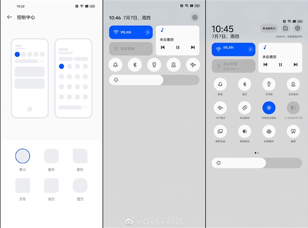
In ColorOS 13, OPPO has made significant changes to the dropdown bar (control center). The top half of the new dropdown bar has a card-like design, with WLAN and data network buttons on the left and shortcut Windows for the player on the right.

However, it can be seen from the diagram that the dropdown bar of ColorOS 13 does not use the operation logic of the left slide notification and the right slide control center, but still integrates the two in the same menu.
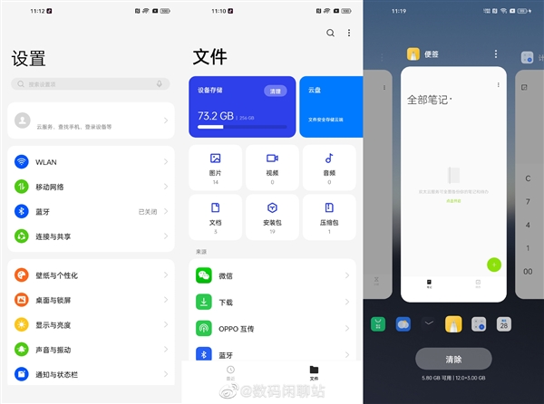
In addition, such as Settings, the UI design of some system APPS has also been adjusted to some extent. The new UI design uses the previous flat design language, but fine-tunes the details.

In addition, OPPO’s custom font “OPPO Sans” has been renamed to “OPlus Sans” in the new version.
In terms of functionality, ColorOS 13 improves the background retention rate of the app and adapts to the free small window, making it easier to use.

Read Also: XIAOMI Mijia 1S Multi-function 5 Modes Air Pump in $34.99 @Hekka Flash Sale
ColoOS 13, based on the Andiroid 13, is currently in its first round of private testing and is expected to open to the public in August.


