The world is awash with data, but one of the biggest challenges is translating that data into meaningful insights. One method for accomplishing this is using visualization tactics, like waterfall charts. These offer a simple, effective way to highlight and delineate shifts in data over time. Keep reading as we delve deeper into the world of waterfall charts.
Unraveling the Concept of a Waterfall Chart

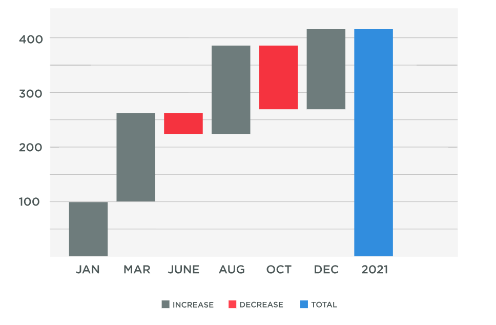
An image showing an example of a waterfall chart
So, how does a waterfall chart work? A waterfall chart, also known as a cascade chart, offers a systematic way of showing a sequence of positive and negative values in an organized manner. These sequential changes allow for a better interpretation of the cumulative effect of sequentially introduced data points.
In the face of complex data, a waterfall chart breaks down data subsets, giving a clear snapshot of where an increase or decrease occurs. It works by representing data values in the form of floating steps, where the beginning and end points show total values. This makes it helpful in understanding the journey from initial to final values.
The simplicity of a waterfall chart lies in its linear nature that effectively tracks growth or reduction. It provides clear, visual signals about data changes, making it an intuitive tool in the realm of data analysis and interpretation.
With most industries becoming data-driven, mastering data visualization tools such as waterfall charts is essential. The ability to visualize changes in data over time can affect outcomes and help in strategic decision-making.
Elements of a Waterfall Chart
The initial block in a waterfall chart represents the starting point. This first block is then followed by steps up for increases in data or steps down for decreases. The final block shows the end result, giving a crisp visual cue of how data input impacts the final outcome.
The space between the blocks, referred to as the connector lines, represents the deviation in data, either positive or negative. A positive variance is shown by a line going upwards, while a negative variance is represented by a line going downwards.
The size of the blocks works hand in hand with the connector lines, indicating the degree of effect each data variation has on the total sum. The larger the block, the more significant the impact it has had on the total value.
Understanding these building blocks is the key to reading a waterfall chart. The arrangement of these blocks creates a fluid ‘waterfall’ effect, giving the chart its name and allowing for a quick, visual scan of data trends.
Impact of Waterfall Charts in Data Analysis

A business professional uses data from waterfall charts to make key decisions
In today’s complex business environment, understanding complex big data is crucial. Waterfall charts offer a way to track change over time, giving companies an easy route to interpret their earnings, costs, and overall financial performance.
The aggregated visualization of changes allows businesses to pinpoint the exact areas of positive growth and negative variance. This understanding can drive changes in strategic decisions, budget allocations, and goal setting.
In addition to financials, waterfall charts are used widely across different functions – from showing project timelines to tracking website metrics. The ability to visually represent changes over time makes it indispensable in every data analyst’s toolbox.
Adopting waterfall charts in your data analysis process can effectively simplify complex data, impact decision-making, and ultimately lead to business growth. Remember, in the realm of data, knowledge is power—and waterfall charts can certainly empower.
Real-World Applications of Waterfall Charts
The applications of waterfall charts extend across multiple domains. From presenting sales performance to portraying demographic changes, the versatility of this visual tool is impressive. It is not confined to one type of data and can serve any context where tracking changes over time is crucial.
In finance, it’s used to visualize net income calculations, starting with revenues, deducting expenses and taxes, and concluding with net income. In project management, it allows you to display a project’s progress over time and against a plan. In human resources, it can depict changes in employee numbers over time due to hires, transfers, and terminations.
Waterfall charts also find their application in technical analysis of stock market trends. The tool provides a simple way to represent stock data over time, highlighting the highs and lows in a clear, visually impactful manner.
Overall, understanding and implementing waterfall charts can dramatically improve the way we interpret and understand data. It’s not just about numbers; it’s about making those numbers tell a story. And with waterfall charts, that story becomes vivid, clear, and impactful.


